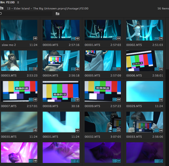
Playback and Reviewing the Footage
We reviewed and selected the shots as we needed to see if all the shots were uploaded correctly to the program and then looked to see which ones were our favoured shots so we were more familiar with the footage. We then labelled all our shots so that it was clear which ones belonged in which scene and then later on when we needed a specific shot it was a lot easier to find. We then grouped all the shots into scenes and put the shots with the male character in a separate section as we weren't sure if the footage was good enough and if it worked well with the rest of our footage. The timeline was for us to arrange our shot composition on and sync al our music with the soundtrack. Firstly, we synced all the footage to the track by looking at the time of the playback sign and matching it to the time on the soundtrack on the timeline . We then created a new sequence by duplicating the sync sequence but erasing all of the other footage apart from the blue scene footage onto the timeline so that we could create the base layer of the performance element. We mainly had mid shots and close ups within our footage which we purposely did when filming but we realised that that was what we mainly had overall, to fit with the conventions of the music genre, of being close to the artist and feeling a personal connection so that it is more relatable for an audience.

Editing the Clips
We chose not to crop any of the shots, as most of our shots were already close-ups and mid shots, we thought that we had enough footage, also we thought that if we were to crop any of the shots, they could potentially lose quality. We used digital tools like the blade, this helped us a lot throughout the editing process, as it allowed us to cut the best shot in the specific place when using the left and right arrow keys to find the right beat to cut on. Then by having cut it, it allowed us to drag back the rest of the footage to the end of the timeline to not clutter the timeline. This helped us to consider the shot composition because then it was easy to substitute the different shots to test which shot fitted best with the different section of the song, as we could see the exact space which the shot needed to be in. We also used markers to mark the beats which we wanted to change the shot on. It was important to lip sync the shots to the soundtrack and playback so then we didn't have to individually sync each shot to the song. We used multiple layer, the first being our blue performance element, we then used that as the fist layer which we would add the slow motion shots onto, then the pink scene, then the beauty shots. We decided that it was important to shoes the shots which worked well with the pace of the song. For explample in the faster paced sections of the song we would use faster cuts and shorter clips, we then used the slow motion shots in the interludes so that it slowed sown the song as it was quite slow paced in these parts. We produced our rough cut then showed it to a focus group, this helped us gain critical feedback to work upon to make our music video better.
Editing the Piece Together
The music video conventions that we have followed was trying to create a personal relationship between the artist and our audience. Our audience is a similar age to our artist, so that they feel they have more in common and can relate easily to the artist. We used cross dissolve transitions between some of the shots, as it is quite a harsh contrast between the pink and blue shots, as it goes from really calm and soft themes like natural makeup and and calm set, and switches drastically to the harsh pink shots. By using the cross dissolve, it softened the transition when the pink scene is introduced. We used a colour gradient system on the program to make some of the colours less harsh on the blue section so that it reinforced the feeling of light and natural. And we then changed some of the colours of the pink to make it less vibrant so it flows better, and then for the beauty shots we made the colours more intense so that the artist was the main feature in each of the shots and the background was less grey and was not of focus.


Well done for making this a visual post. Good use of screen shots to develop upon your points. You have written a detailed step by step account of your edit, as well as reflecting over why. Though you could develop your reflective editing by considering how successful certain stages of your edit were, this is a detailed an overall good post.
ReplyDelete