Tuesday, 1 March 2016

My Final Music Campaign and Products

MUSIC VIDEO :


DIGIPACK :

Front Cover


Inside Cover (Left)


 Inside Cover (Right)


Back Cover


WEBSITE :

http://izellaoxenham.wix.com/emseroseofficial


Thursday, 25 February 2016

1. In what ways does your media product use, develop or challenge forms and conventions of real media products?

Conventions are symbols or technical elements which are used to suggest a genre or something that is used to attract a target audience. They are stereotypical signs to show the genre used through camera work, editing or mise-en-scene.

Symbolic conventions are a colour or symbol which can be used to represent something specific to the genre. For example, the colour red could be symbolic convention of love. Or a pop band wearing colourful clothes to represent their genre of pop, as it is upbeat.

Technical conventions are elements of the setting or lighting which connote different hints towards the genre so that the audience who is consuming the media, can immediately form opinions about them and have something which appeals to them s a target audience. For example, the lighting on the stage at a concert of a pop band, may be brightly coloured and bubbly, whereas a heavy metal band, may have a dark setting with a spotlight on an instrument or particular band member to show that they are about the intensity of the music.

Below is a slideshow of comparing real life products, using Florence and the Machine, Birdy and Marina and the Diamonds. I compared different elects of their music videos, websites and album artwork to compare conventions or their products to mine, to find similarities and differences.


Tuesday, 23 February 2016

2. How effective is the combination of your main products and ancillary texts?

This is our video for our Evaluation Task 2, discussing how effective our main product was compared to our ancillary texts. We discussed how all three of our products linked into each other and how we considered theories, like Dyer's Star theory and Negus' theory, fed into our ideas and the products.


Our three products overall link together to create an image for our artist, to promote her to her target audience. We used Negus' star theory, to create an accessible artist who was relatable to an audience so they could connect to her on a personal level, but also have her as a role model, so therefore inaccessible. We did this as in our music video we used a direct address in a lot of our shots which connected her to the audience, we also used this technique in our album artwork as she is looking directly at the camera on the front cover, which is immediately the first image and impression the audience get from the artist, this makes her personal and connects them immediately, therefore her being accessible to the audience. We also used this idea of accessibility by making the artist relatable by having her fashion similar to a target audience. in the music video, we used the costume to show the style and artistic style to the artist, but in the album covers, we got her to wear, urban clothes, which were typical of members of her target audience.

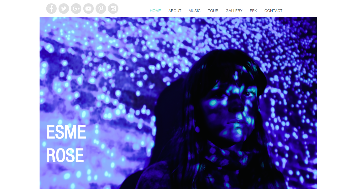
The unaccessible element of our artist was the fact that her talent was reflected through the organic connotations through the natural setting of her album cover, which made her stand apart from the typical teenager and is obviously shown through her talent in the music video of singing. The fact that she is also attractive and her modelling shots are shown on her website makes her someone that her audience can look up to to look like. The unaccessible theme was also shown across the light themes in the music video and the website homepage, as the colours are synthetic and non-natural which gives a dreamlike perspective to the artist.

The products work together as all of them have an element of nature, to promote her as an organic artist. In the music video, the movement reflected the mood of sound of her song. On the album artwork, the natural setting and use of minimal makeup. And in the website by taking a synthetic looking image which is actually from a natural source and putting a twist on it to make it fit in with a similar colour scheme as the music video, so the link is made.

I think that as a whole music campaign, the products work together as a package because Negus Theory of organic and synthetic artists are put across in a balance amongst the products. And Dyer's Star Theory of accessible and inaccessible is also put across to the audience to make them want to get to know her and therefore have interests in the products and her as an artist.

Monday, 8 February 2016

3. What have you learned from your audience feedback?

Below is a Prezi, on my feedback gained from the production stages of creating my final Music Campaign.


What have I learned from my audience feedback?


In the initial stages of our idea development we mainly used YouTube to record and upload the verbal feedback that we gained from so we could repeatedly review and develop ideas based on the feedback gained by our class.

We then showed a focus group our rough cut of our music video. We gave them a questionnaire of open and closed questions and filmed their responses to some of the feedback then collected the questionnaire sheets and summarised the information to develop on.

A demographic audience includes gender, age, race, nationality and job. The demographic audience that we chose to use for our feedback was of both genders as our target audience was of both, that were interested in our artist for different reasons. We used the same age group of 16-18 years old, from a range of different backgrounds, so that we could get a variety of feedback, but from the same sort of demographic. I few had used a different demographic, the feedback would have been useless as we only care about what this demographics opinions are. The readings they produced were shown on our focus group questionnaire feedback. This was a reliable sample size as well as they came up with generally similar answers to the questions and their qualitative feedback was mentioning the things that were specifically targeted at their age group.

A psychographic audience is based on beliefs and views. As our main target audience was of a young age group we decided to use the teenage Vals categories

The disadvantages of using YouTube - We couldn't generate any new feedback it was just a recording of our previous feedback so it wasn't an ongoing source that would be updated.
The advantages of using YouTube - it was a permanent source that could not be lost and we could go back to it at any point.

The disadvantages of using Focus groups - The groups could conform to each others responses even if they did not believe that that was the case. By being in a focus group situation, it could intimidate them to give negative feedback, therefore may not having reliable responses.
The advantages of using Focus groups - We could gain opinionated responses that were immediate responses to watching our music video.

The feedback that was positive in our focus group was that they liked the pink element when we shoed them our rough cut, so we decided to add more clips of the pink section. They also liked the cross fade editing, so we decided to add more cross fades, as they mentioned the it helped add to the effect of dreams.

Some feedback that was not helpful was that someone mentioned in the focus group that they thought that the artist was too seductive. This was unhelpful as we could not change our artist or refill any sections of it. However we decided to work on this, we had less shots of focusing on her face, and included more shots not of her directly looking supposedly seductive.

Using the Uses and Gratifications Model we used personal identity, as our audience has the ability to compare themselves within the media, so they can explore personal problems and perspectives. this theory discusses how an audience specifically choose the media that they consume. We have used this theory and applied the point of an escapism. Our feedback from our music video was that our themes were dreamlike and gave the impression of a supernatural mood, this acts as an escapism as it is bringing the audience to an unrealistic life that is better than theirs, which will attract them to our artist.

For our music video, our readings from our feedback showed that the responses were along the preferred reading as they got the theme of a dreamlike setting an understood that it was meant to be visually interesting and artistic, rather than about a real life scenario which the audience would relate to. However for our album artwork the feedback received oppositional reading, as the audience didn’t see the black and white colour scheme as a sign of an organic artist. 


It has been important for us to gain research into audiences of our product and also get feedback to create our artist from, as without the audience there would be now product. The online media is transforming the way audiences engage with media texts to a deeper level.


Thursday, 14 January 2016

4. How did you use media technologies in the construction and research, planning and evaluation stages?

Below are three Prezis, including details on the technologies used throughout the production stages of my Music Video, Album and Website

Saturday, 26 December 2015

Editing Website Images

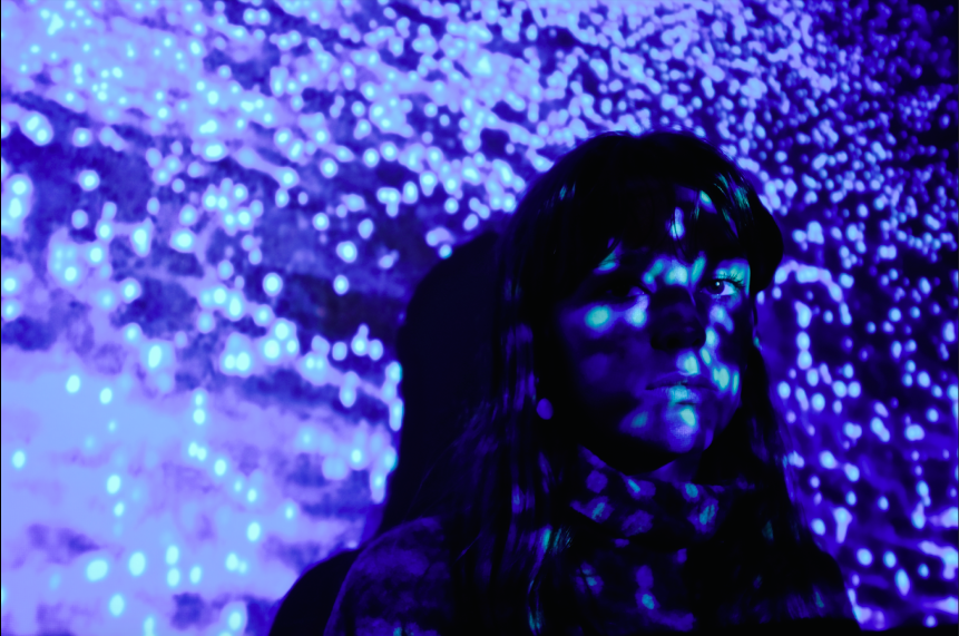
For the website image, we chose one that was at a slight angle as we thought that the shadows from the projector created an interesting effect. We then changed the light, colours and levels of colour on the colours and lighting histogram.


Before


After


Thursday, 24 December 2015

Photo Shoot for Website + Photos

For the photoshoot for the website, we had Esme stand infant of a projector and projected the image of plankton on a beach. We wanted to have this bright image, to give the sort of effect of the UV which we were planning to use in our music video. The blue lights link with our music video of the sort of dreamy theme.


Tuesday, 22 December 2015

FINAL ALBUM DESIGN

Front Cover


Inside Cover (Left)


Inside Cover (Right)


Back Cover


Monday, 21 December 2015

Editing Album 2nd Draft

Firstly I increased the brightness on this image so the colours weren't so bold.
I then increased the contrast slightly so the features weren't lost in the brightness.
I then created another layer of plain white and layered it on top of the edited image. I then changed the blending scale of it to make it more of a wash over the image. I like this effect as it is sort of like a fade for the image so it isn't like a cover but more like a secondary photo. 


For the album cover image i got rid of any blemishes or bags under her eyes by using a blurring tool.
I made her lips slightly larger to create a more idealistic artist by using a bump distortion tool.

Sunday, 20 December 2015

Album 2nd Draft + Feedback

 Cover

I think we need to edit this image further to get rid of blemishes.
 Inside Cover (Left)

I think that if we edit this image further, we should increase the brightness so the image doesn't stand out so much, as I think that the front cover needs to be the most standing out image.
 Inside Cover (Right)
Back Cover

For the back cover we looked at a other album covers and we need to have a barcode in the bottom corner to make it look more realistic. It also needs to have some legal information.

Friday, 18 December 2015

Selection Process (Album)


These are my finalised images which I like from the shoot by the black background outside.
Above is the only good image that we all like from the studio lit, headshot. However, I think these are too boring so I think we should stick with the outside shoot.


These are the shots of the sunset background with trees. I like these shots as they include the whole nature aspect that we were going for.


To the right are two of the below angle shots which we like. I like them as they are quite interestingly angles shots, which show good features of her face.


Here is a series of shots in the same location of by an overgrown wooded area. I like this location the best as it shows the nature side, but with an edge with having some sort of build around so it looks like more of an inclosed space which I feel creates a closer link between the audience and the artist.


Thursday, 17 December 2015

Photo Shoot for Album Cover

We used a Fujifilm care to shoot the photos. We decided on using multiple locations to ensure getting a wide variety of shots that we could use and edit to test out which setting worked best.


We decided to use outside locations instead of just shooting headshot, which when we shot them, we thought they would be boring for the album cover.


We found an outside setting which had an urban look to it when looking the lens of the camera. We thought that this fits with the conventions of the other album covers that we looked at in our research. This added a sort of dynes to our artist, as if the audience only had an idea of what she was like through her music video and if it were to be just headshot for the album cover, the image of our artist would be quite boring and unrelatable.

We also found some outside locations which had a natural look to them which we thought would show a good contrast between the urban look. In our research into similar artists we found that the conventions which most of the artists used was a combination of aspects of nature juxtaposed to an urban setting which created an effect of nature within their music to a contrasting aspect to an edgy twist to their music of technological sound.

Wednesday, 16 December 2015

Album 1st Draft

Front Cover


Inside Cover Left


Inside Cover Right Disc


Back Cover


Website 1st Draft


This is our first draft of our homepage. We used screen shots from our music video just to arrange and discuss composition, however we will organise a photo shoot to obtain new photographs but using this as a template. What we discussed after creating this was if we wanted to continue using the bright colour scheme which was in our music video. We thought that if we did use the bright colour scheme it would only reflect the music video not the artist herself. This is the first draft, more for just learning how to use Wix, but also so we could think about composition of her face on the website page. We like the thought of having an angular image for the main background photo, but with a different colour scheme, maybe more intense with darker tones. I think that we should use the idea that we had for our album artwork as the home page instead of the album cover, because i think that it would be better for the home page. I think we should use a dark theme with a euphoric element to link back to the music video but very subtly so it doesn't use the same makeup or lighting, so basically using the euphoric, dreamy element in a completely different way.

I think that by using images like these, it will make the whole homepage look less intense, as i think the colourful theme, with all the bright colours seems to fit more in the pop music genre of a girl band or pop artist. I think if we used images like these in projections in the photo shoot onto her face, and have similar angles to the ones we have already used on the homepage.