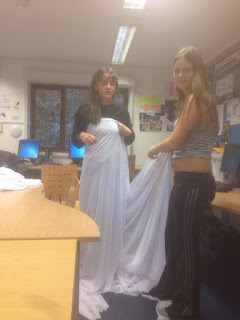
Before the shoot day we firstly made the dress for the female actress to wear. As we wanted her to fit in exactly with the set so she would seem as if she was submerged within it, we needed to use the same fabric that we were using for the set build. We used one of the satin like material for the base of the dress as it was opaque and we didn’t want her to wear anything that didn’t fit with the set. We cut a small part from the fabric then measured it around her body. We then marked how short we wanted it to be. Rosie then sewed the dress so it looked neater giving it a hem and a string around the top to tighten it. We then took some of the mesh like fabric that we were also using for the set and created a wrap to go around her that was long enough to tie into the set so it looked like she was more a part of it.
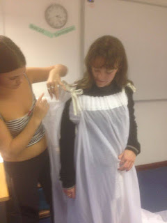
We then took the remainders of the fabric and cut them into strips length ways so that they would be long enough to hang from the bars at the top of the studio and reach the ground.
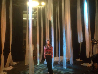
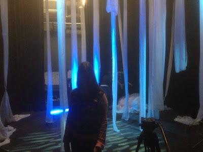 We then used Zell to act as if she was the actress and
see how the pieces of fabric would work with in the set interacting with the
actress, we could then make adjustments to the positioning of the fabrics so
that when it came to the shoot day we wouldn’t waste time figuring out how to
wrap her in the set. We then tested out the different lighting setting we would
need to use for the shoot so that they were ready and we could see what they
looked like against the sheets.
I was confident that we were well prepared
as we had got all of the set designing finished by the end of the day before.
However, it was due to rain on the day of filming which worried me as we could
have no control over it and it would eliminate a whole element that we had
prepared, but I was trying to plan what we could do instead of the woods scene,
and if we would shoot that scene on a different day.
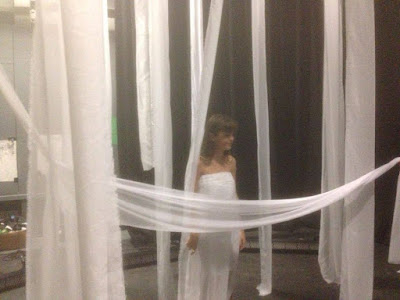 We had to make a decision about if we were
going to film in the woods of not, and we decided that we would shoot it on a
different day and utilize our full day of time in the studio to create more
interesting shots and experiment more with what we had there. We then had to
take Esme, our actress to the makeup artist. We all had a very clear image in
mind of the different makeup looks we needed as we had discussed them in great
detail prior to the shoot day. We all overlooked her makeup being done as we
couldn’t do anything with the set until she was ready as all that was left to
do was to tie the fabrics to her dress. It allowed us to point out anything that
we thought didn’t look great so we all had an opinion towards the makeup. We
then had to place Esme in the set and make minor adjustments to her dress by
safety pinning it so it was properly fitted. We also realized that it looked
quite messy the way we had put in on her so we had to use different pieces of
fabric to cover up the messy parts. We then tied her overlaid mesh dress into
the set and make sure that she could move around easily. We then did a run
through of the choreographing that we wanted her to do even though we had done
rehearsals with her already but we needed to use the fabrics and tell her how
to interact with them. We did a run though with the track and lighting but this
allowed us to get in the set and show her he movements we wanted her to do and
how she should move between the sheets.
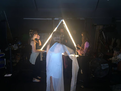
 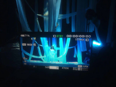 I think that the studio looked pretty much
exactly how we expected it to be and how we sketched the fabrics in our
planning. However, the fabrics took up less space within the set than I thought
they were going to, but when we looked at the set through the lens of the
camera it looked fuller. When we turned on the lighting, it was a lot brighter
that I expected even though we had tested it before, but I think that how it
was in my head wouldn’t have worked as well with the themes. The lighting made
our thoughts on the idea change slightly, as initially we had a pure based
theme, however when we were actually on set, it took more of a supernatural
look, and an enhanced water feel.
I think that the studio looked pretty much
exactly how we expected it to be and how we sketched the fabrics in our
planning. However, the fabrics took up less space within the set than I thought
they were going to, but when we looked at the set through the lens of the
camera it looked fuller. When we turned on the lighting, it was a lot brighter
that I expected even though we had tested it before, but I think that how it
was in my head wouldn’t have worked as well with the themes. The lighting made
our thoughts on the idea change slightly, as initially we had a pure based
theme, however when we were actually on set, it took more of a supernatural
look, and an enhanced water feel.Above is a video of our set before we began filming.
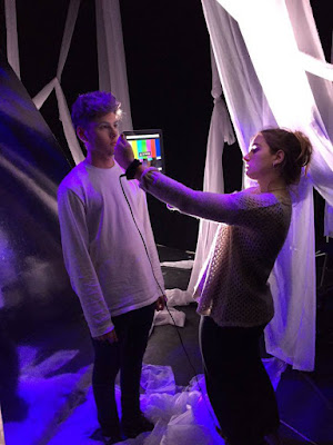 On the day of the shoot, my main role was
to be the camera operator as I had had more experience than the other members
of my group in that role, as that was my role when filming my thriller for my
AS shoot. Zell was the director as she has her enthusiasm, we thought would
keep the actress up beat and stop her from losing energy, Zell is also good at
communicating ideas into a visual performance. Rosie was the art director as
she is good at spotting continuity errors and she has good artistic skills so we
trusted her to keep track of things we needed to change or adjust throughout
the day. Over the course of the day our roles varied slightly because as the
shoot went on we all had more idea with what could look good and new
suggestions for different shots and change of choreography. Once I had been the
camera operator foe the whole morning, I had a good idea of what worked through the lens of the camera so it
was easy for me to direct Esme to do things that would work especially well
behind the camera. I think our teamwork within our production roles made the
filming process smooth and we all work very well as we have a variety of
strengths and weaknesses that play off each other. The energy between us was
hight even towards the end of the shoot, which I think made it easier to think
of new creative ideas that came to us on the day, and this high energy stopped
the actress from getting tired so she looked like she wasn’t lacking in
charisma towards the end.
The main problem we had on the day of the
shoot was the weather issue. We initially though to overcome this problem, we
would reschedule to shoot the woods scene on another day when the weather
conditions were suitable. However, as the day went on, we realized that the
lighting on the day of the shoot was different to how we initially thought it
would look, the look it began to shape was more of a futuristic and sci-fi. We
then thought that the lighting that we had would clash with the lighting in the
woods and it just wouldn’t go well together, we thought that it would just look
out of place and confuse the direction of the narrative that our shoot was
taking. We also thought that we had loads to work with and the set that we
created allowed us to explore with so many more shot compositions than we
planned. By having the whole afternoon to use the studio which we did not plan
to, it gave us so much time to think of new ideas that would fit with the look,
so overall this problem actually turned into a benefitting factor for out music
video as it changed our idea for the better and made it stronger. By the end of
the day we realized we had enough footage to make a good music video combining
our original element idea with new ideas that us as a team created, therefore
we cancelled the rescheduled shoot for the woods as we thought it would be
unnecessary.
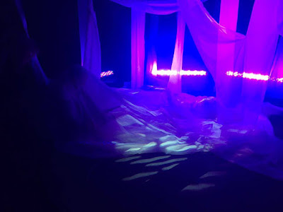 I think the most successful part of the
shoot was how the actress interacted well with the camera and the way we could
move through the fabric on some specific shots. Especially the tracking shots,
they allowed us to move around the set so it gave a great dynamic to the set,
it made it more mysterious and we all agreed that they turned out a lot better
than expected. We also decided to do a scene with changing the lighting to an
extreme purple tone to go with the makeup of the second theme, which contrasted
from the deep blues. We only thought of filming this scene when we got there and
were testing out different lighting techniques. We put Esme under the organza
material that was on the floor, to create a different take on the materials and
to make the video more personal with the actress, so it made her look like she
was the artist more, rather than just an actress.
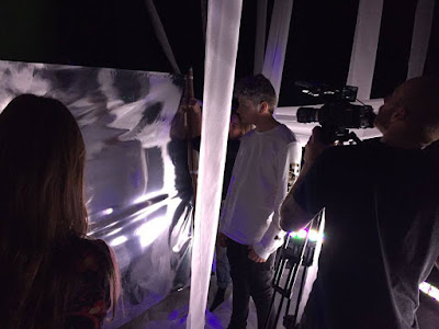
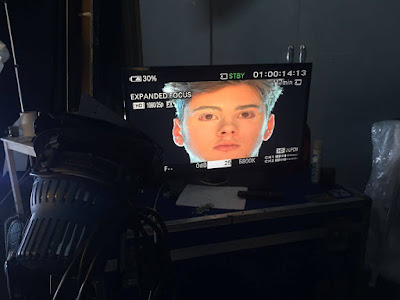 As we changed our idea on the day as we
decided not to film in the woods, the male characters role became less obvious to us what we wanted to use him for. We improvised however with different
reflective material and him performing but I don’t think those shots fit with
our original concept that much even though it fitted with our new theme. The
fact that we were improvising to an extent, meant that our planning and
original ideas couldn’t really be done. When it came to filming the actor, his dancing
was very stiff and looked quite forced, rather than a natural flowy dance,
which is what we tried to get him to do. Towards the end of the shoot, he
loosened up but this gave us little time to film and experiment with shots.
This could have gone better if we got him to practice more behind the camera
and we planned a variety of sequences to film with him to get more of a variety
of shots to use.
As we had two actors, it wasn’t hard to
keep them managed. We asked them and reminded them several times before the
shoot to memorise the lyrics which they did, and they were both prompt to set
when they were needed. As we were all working together on the set, it allowed
us different points to choreograph them as they went to make slight
readjustments if we thought it was necessary.
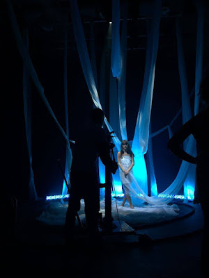 I really enjoyed creating the slow motion
tracking shots, as each of them gave such a good effect that fitted with our
original idea. The slow motion worked so well with the fabrics being blown by
the fans as it created the water sort of theme we were going for. It also gave
such a good effect which we will be able to use in the interlude sections of
the song, where we wanted to create a slow moving effect that was really flowy.
By using the track, it allowed a completely different and dynamic perspective
of the set and allowed us to connect well with the actress as she could follow
it with her bod and eyes rather than just being static in front of a still
camera.
I really enjoyed creating the slow motion
tracking shots, as each of them gave such a good effect that fitted with our
original idea. The slow motion worked so well with the fabrics being blown by
the fans as it created the water sort of theme we were going for. It also gave
such a good effect which we will be able to use in the interlude sections of
the song, where we wanted to create a slow moving effect that was really flowy.
By using the track, it allowed a completely different and dynamic perspective
of the set and allowed us to connect well with the actress as she could follow
it with her bod and eyes rather than just being static in front of a still
camera.Below is a video of how the track worked and how it moved around the set.
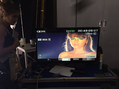 Im really looking forward to how these slow
motion shots looked in the edit as we have so much material of these slow
motion shots which will look so good with the different sections of the song. I
am also excited to cut the different slow motion takes together as I think it
will create a really similar effect to what the music sounds like.
 Below is a video of one of the slow motion shots being recorded then buffered.
 I think that we would have benefitted by
brainstorming right at the beginning of the shoot all the possible new ideas we
could have come up with by actually seeing the set having been built rather
than just in our minds. This would have allowed us to have sufficient shots to
work with in the edit even if we didn’t use them, it would be useful to have
the possibility. So for a future shoot, I think it would be beneficial to see
the conditions of the day and not rely on planning as you cannot predict some
events that can completely change your idea, so instead of dwelling on what we wouldn’t
be able to do, which we did for a while, we should move straight on the think of
it as a positive and create different ideas due to the conditions of the shoot.
I think that we would have benefitted by
brainstorming right at the beginning of the shoot all the possible new ideas we
could have come up with by actually seeing the set having been built rather
than just in our minds. This would have allowed us to have sufficient shots to
work with in the edit even if we didn’t use them, it would be useful to have
the possibility. So for a future shoot, I think it would be beneficial to see
the conditions of the day and not rely on planning as you cannot predict some
events that can completely change your idea, so instead of dwelling on what we wouldn’t
be able to do, which we did for a while, we should move straight on the think of
it as a positive and create different ideas due to the conditions of the shoot.Below is a video to show how we shot the beauty shots and the lighting. It also show how the lighting has an effect on her face.


