Friday, 26 June 2015

Lip Sync Excercise


Before the lip sync exercise I learnt the lyrics to the song 'Shake it Off'. We watched a few music videos to get an idea of the different conventions of pop music videos which is what we were going to be filming for this exercise

In the studio we got into different groups to film the video in. we switched roles from the cameraman to the actors on the set. 
We learnt how to use the cameras, the first on being Canon 5D mark 3, which has the best quality out of the cameras which we used on the day.we learnt that on cameras like these there is no zoom but to focus it correctly onto the focus point you must measure the distance between the cameras and the subject and program it into the camera. We used this camera on the scene on the sofa and the subjects were sitting in one place and we wanted he best quality focus.
We used an NX5 on the set with the green screen, this camera could zoom so we didn't need to use the tape measure to measure the distance from the camera to the subjects, we just needed to zoom in to the face of one of the people and focus it accordingly and then zoom out. 


On the dolly shot set we used an FS100, this is the first time I've used a dolly and I found that it created quite a good effect when it came to cutting the footage and added dynamic to the music video in the more high pace sections of the song. 

When we were in the editing suite, we uploaded all the footage from the filming onto Adobe Premiere Pro which I have used before when editing my Thriller, so I had a basic understanding of how to work the program. I learnt how to upload all the footage i wanted onto the time line and then how to sync it with the soundtrack. I learnt how to sync with sound by hearing out for the first base drum beat on the soundtrack which was playing in the studio then sync that with the first base drum on the actual soundtrack which was on the timeline. I learnt how to sync with image so matching the time from the song on the timeline with the clip of the clapper which was played in the studio when we were filming before playing the soundtrack in the background. We then cut the clips on the timeline and I learnt how to use the cutting tool to cut the clips where I thought they would change. 
During the editing process I was just trying to get the hang of actually cutting and editing making sure that all of the footage was synced but next time I think the process will be quicker and I will be able to match shots according to pace and the actual lyrics and making the sequence more specific to the beat and lyrics of the song. 


Friday, 19 June 2015

Andrew Goodwin

Goodwin think that music videos narratives don't go along the same lines as a traditional narratives. Traditional narrative being along the lines of Todorov where he stated that there was an equilibrium followed by a distraction then a disequilibrium, a force then concluded by a new equilibrium.

Goodwin states that pop videos don't have a linear structure but are just built around the song as there is repetition with the choruses and is made non-linear when going back to the verses. The singer(s) in the music videos are used as narrators and characters within the narrative.  The singer breaks the illusion of reality by looking directly into the camera to involve the viewers within the world of their narrative, this is an extension of music hall performance.
There are three types of relations between songs and videos: #

1. Illustration : where the video tells the same story of the lyrics in the song.
 For example : Madonna - "Papa Don't Preach"
The lyrics in the song are directly translated into imagery. On the line:
"Cause I was always your little girl" it shows an image of her with her Father as a child in a memory using old film to show it was in the past,
 "You always taught me right from wrong" it shows the Father telling her to eat her food and then help with he washing up.
 "The one you warned me all about, The one you said I could do without" it shows a rebellious looking boy who is clearly the person she is talking about in the lyrics.

2. Amplification : where the lyrics have a loose connection to the imagery but it may be used to create a deeper meaning that may not have been picked up from the lyrics.
For example : Basement Jaxx - "Where's Your Head At?"
 The lyrics of the song are relating to the video but in the lyrics there is no suggestion of any scientific. There is a repetition of  'Where's your head at?' When the scientist is explaining puppet animals and how they're playing instruments it has no relevance to the lyrics but it still is showing that it doesn't even make sense as an image.

 then one of the band members is playing a character within the narrative of the puppet monkey turning into one of the band members. This extends the narrative as it is quite fitting as it doesn't actually make sense like suggested in the lyrics 'Where's Your Head At' but there is no suggestion of monkeys or puppets in the lyrics.
3. Disjuncture : when the lyrics have no link to the imagery in the music video and sometimes even contradicts the lyrics which are being said.
An example of this is Groove Armada - Suprstylin

Wednesday, 17 June 2015

Negus - Organic and Synthetic Acts in the Music Industry

Negus' theory:
An organic act is an act that is real. An act that is talented and has creativity within their music. They have been supported by the label to continue doing what they have been doing to make a career out of it. An example of an organic act could be Amy Winehouse, Queen, The Eagles. The type of audience that these acts usually are aimed at are more sophisticated people that are fans purely for the music and not so much their image. The function that these acts have is to provide a long term money revenue stream and as a long term career.
A synthetic act is an act who are not necessarily real musicians but are constructed by a label. An example of a synthetic act could be The Spice Girls, One Direction. The audiences that these acts are usually aimed at are younger more naive audiences who are more of a fans because of the image that they like. The function of these acts are to get a quick injection of cash but aren't for the long term. they do not need that much investment to create their image.


I analysed an album cover by the act Amy MacDonald who is organic. However even though the image of Amy MacDonald is made to look completely organic, it is also constructed to present an image to an audience by the label like it would be in synthetic.


Above is an album cover for Katy Perry. She is an example of a synthetic act. The bright colours in the image show that it is a pop song and gives an indication that she is appealing to a younger audience who is more interested in image. She isn't wearing any clothes which again reiterates the fact that she is promoting her image. there is no indication of her being a musician which shows that she may not be as talented or creative which contrasts to album covers like Amy MacDonald. the bubble writing is less serious and childlike which again appeals to a younger audience. the Candy like font creates a cartoon image. He facial expression shows no indication towards the music but to show sex appeal to the audience as she is quite heavily made up with pink lipstick. 

Tuesday, 16 June 2015

Conventions of a Website in the Pop Genre

I will be discussing the conventions of the websites for boy pop bands and the similarities shows in each of the sites.
The colour scheme of the website shows a lot of purple which would appeal to a young female audience which is the target audience for this genre. The largest image on the page is of the band performing which shows the audience their talents in their music that they are genuinely good musicians. The image of the boys in the shot would appeal to a young female audience as they are good looking which will attract interest in the band without even listening to their music. the font on their page would attract a young female audience as it is like the font of a teenage diary. it gives the option on the homepage to look at their latest videos, which look like they have been taken on camera phones which gives the impression that the viewers of the website get privileged access to the life of the members of the band. 


The header image on the website for One Direction is an close up of a picture of all the members in the band. It looks like it has been taken by one of the members of the band which similarly gives the impression of privileged access to the life of the band and that the audience are with them. The image of them attracts a young female audience as they are good looking and their selling their image. By showing one of the members holding a guitar and their others holding microphones it is showing them being talented and creative which is what the audience should be supporting rather than their image. The size of the font which shows that name of the band it written boldly across the image to make it well known who they are so that when the image of them is presented to an audience they will know to listen to their music.


The image shown primarily is of the band members not even playing music which supports the convention that they are promoting their looks and image rather than their music.The tour dates are immediately available which makes it easy to order tickets and increases the likelihood that the viewers will buy tickets. The pink font appeals to a young female audience. The pages which are available for the different band members creates a personal relationship between the members of the band and the fans. 


the homepage of the website for this act is similar to the one above as it gives the option to view the individual members of the band therefore enabling the fans to create a more personal relationship with them and allow the label to create individual personalities for the fans to base their opinions on and so the fans do not create an image in their head based on their opinion of the band as a whole. the link which is for 'members only' gives the fans a personal relationship which makes them feel closer to them and gives the impression of privileged access similar tot eh previous websites of the other bands within the same genre.


Monday, 15 June 2015

Building my First Website Using Wordpress - for PEACE

 Firstly when I created the page I changed the header image to a photograph of the members of the band with their logo in the background to get an immediate representation of their band image.

 I then layered a title with the name of the band in capitals in a slightly transparent font so the image was still fully visible.

I then added a footer by adding a footer of a link to the new album of the band, so that it is available to view on different areas of the page to promote the product.

I also created a new page on the website with a link and an image of the album so that it is immediately viewable on the website.
This image above shows where I have created pages and they show up below the header image and give links to the different useful pages for tour dates and new album.


On the tour dates page I created a link to the page where you can actually buy the tickets along with dates and locations of shows.

LINK TO MY WEBSITE -  https://elizapollock.wordpress.com/

Thursday, 11 June 2015

What do audiences 'get' out of watching music videos?

The effects model (1950s) suggested that media is harmful to the audiences and that media can make audiences aggressive, rebellious, and can change people. It also suggested that audiences are passive and allow the media to manipulate their personalities.

Blumler, Lazerfeld and Katz contradicted this theory by saying that audiences to media are active and take what they want from the media to fulfill different desires. 

What do audiences get out of music videos?
  • Diversion = and escapism from mundane realism. They will imagine a more exciting lifestyle by using media figures lifestyles which are presented to them.
  • Personal relationships = felling a friendship with the characters within a text. may be from a familiar setting, direct address, privileged access, or an idea of the personalities of the star.

1. OG Maco - "U Guessed It"
The hand held camera movement, the direct address in this music video in some sections creates the personal relationship between the audience and the characters. The setting of them all being crowed into a lift gives the idea that the audience are getting a preview into the backstage, privileged access tot he life of the stars

The diversion to the fun, party lifestyle which the characters are taking part in; will intrigue and audience. 
The showing of the security guards and the characters when doing what they want gives the illusion of their authority above the rules and by having this famous, party lifestyle and that they are above the laws. The up close shot with the character leaning into the camera gives off the impression that he is aggressive and authoritarian.
The electric colours shows a psychedelic drug reference which again refers to an authority above law. This gives the audience an insight to lifestyle of the artists. 


2. Disclosure - "Grab Her"
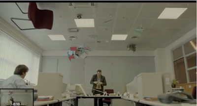
The music video uses surrealism within a mundane environment which makes it visually intriguing.It is mocking the corporate lifestyle by using the metaphor of how workers in those environments make it impossible to do their jobs but they just have to carry on and not complain which is why the video is comical.  It makes the audience wonder how they made it, it is technically and creatively innovative. The personal identity aspect is what relates the audience most to this music video as there is a shared value between the audience and characters within the video.
The vanishing point within the image gives the images a balance and a focus point around the struggle the employee is having in the office with the surreal problems. it gives the clip comedy because the focus on the problem is unrealistic in a boring work environment which contrasts to what is going on in the shot. 
The image above shows a comedic impression of how people feel about people in authority to them. It makes the video funny and want to watch it. 
The attention being directed to wards the males shows that he is out of place and an unfamiliar character in the environment which would usually be expected. 

3. Hyuna - "Red"

 The sexually provocative aspect of this music video by having the references of the bananas, lipstick, attract a straight teen male audience and to young females wanting to diverge into that body image, styling and the fashion of the artist.
 The dismemberment shots of the breasts, bum and crotch objectify her as a female and make her more of a sexual object which is why males would be more attracted to this music video.  the body language of the artist is provocative and sexual which relates to the music itself and sells the product
 The group shot shows the desired party lifestyle, with the leading female in the middle of the shot with a spot light on her. the colour within the shots is mainly pinks reds and white. These are stereo typically female colours which adheres to the stereotype of females.  


The females black PVC outfit is a sexual reference which is adhering to the submissive personality of females however she is onto of the cage showing her dominance within the sequence which subverts her stereotype that she is creating for herself. 
The shot above of the female just surrounded by lips just highlights that females are being portrayed as purely looks and provocative.

4. Beyonce - "Pretty Hurts"

This shot shows all the people backstage which gives the impression that Beyonce, even though she is a star, she is like everyone else and puts in effort to look the way she does which is how many people aspire to look like. the backstage image gives the aspects of seeing behind the scenes like it is privileged access. 
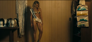
 The isolation among her trophies suggests that the pageant girl lifestyle is lonely and not that great when you get there. this shows to the audience that even though they aspire tot look like her and everything it inst all that great when you get there. It makes it able to the audience because it shows that even if you are famous you feel isolated like normal people.
 The image of the judges looking at her and scoring her shows that even she feels judged by people and it is highlighting that everyone has insecurities that they may feel judged about. This will make her target audience of teenage females want to watch this music videos to feel better about themselves that someone as talented as Beyonce has insecurities that they are judged on.
 the image of Beyonce being measured and then dismissed again highlights the judgmental society which we live in where there are actual measurements that are considered "pretty" and again relates back tot he audience as they will feel an empathetic connection between themselves and the star which makes them feel better about themselves which is what they get out of the video.
 
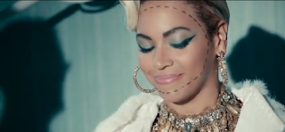
The dotted line around her face shows that she is resorting to plastic sugery to fit ina nd be considered pretty by others around her. this shows the extremes people are willing to go to, to fit into society.
The shot at the end of her alone in the shot again reiterates her isolation within society. which shows that even with all the drastic measures to fit in, she still feels the same. this shows that the audience should be embracing their looks because however hard they try, they should not try and look like everyone else just to fit in or be accepted. 


My music

Monday, 8 June 2015